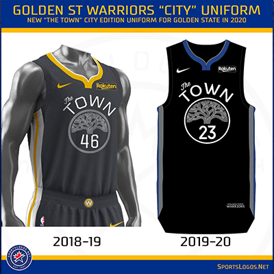
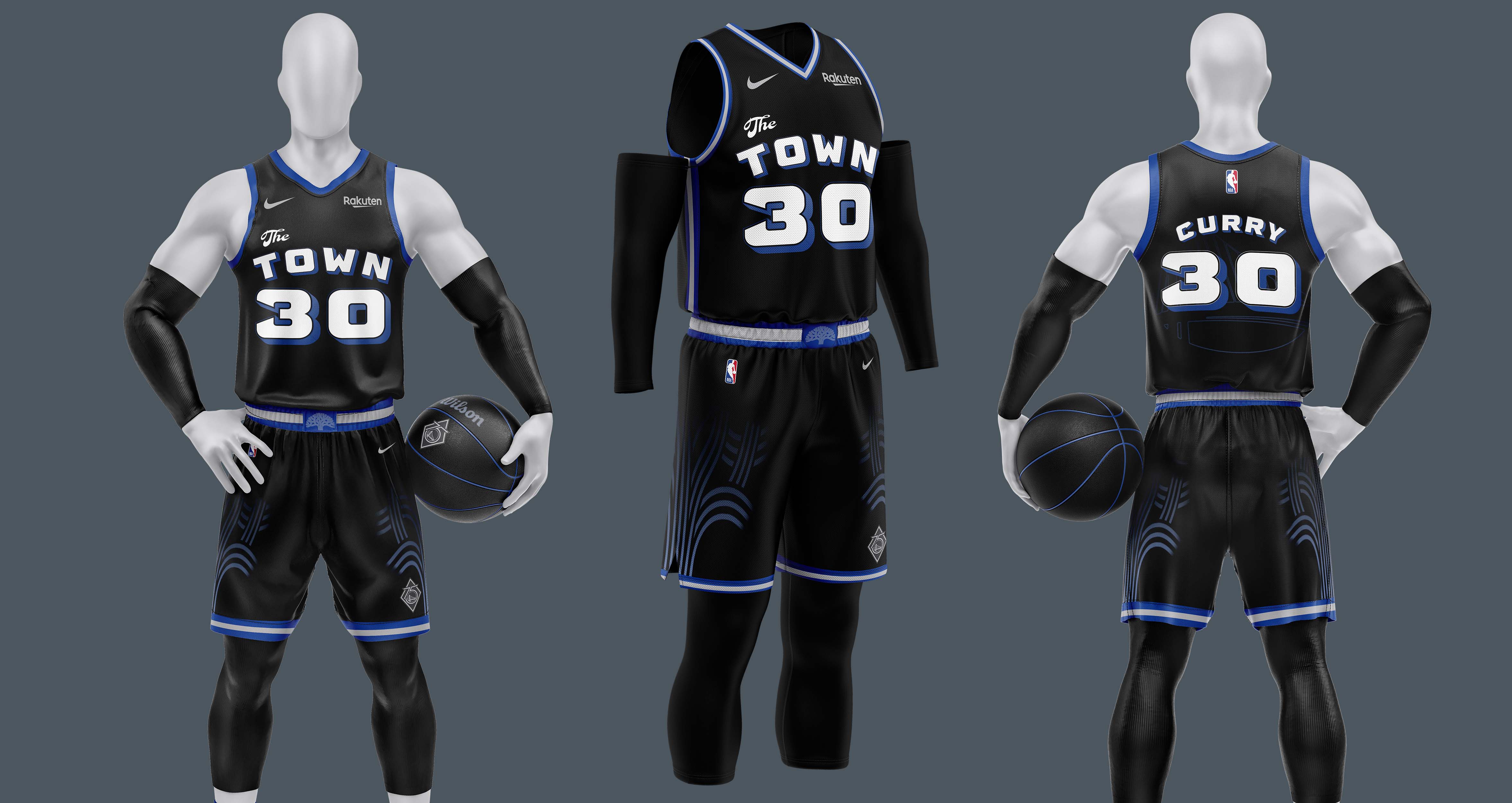
The Warriors introduced “The Town” to honor their deep roots with Oakland, where they played from 1971 to 2019. This is their acknowledgment to the city and community that shaped their current identity before relocating to San Francisco.
Apparel
Product Design
Tech Packs
Research
Sole Designer
Project Lead
2022
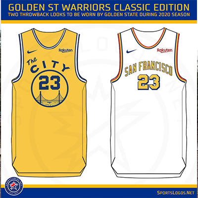
The Warriors have always done a uniform that either contains the Golden Gate Bridge or the Oakland tree, once in a while they will do a uniform that's just their name and numbers. With the design decision to break out of this norm and put these icons in places that the Warriors might not be known for.
The design direction that was taken was how can we rethink the exisiting "The Town" design through either designing a new idea to celeberate next year or just go down the pathway of designing something they're not known for.
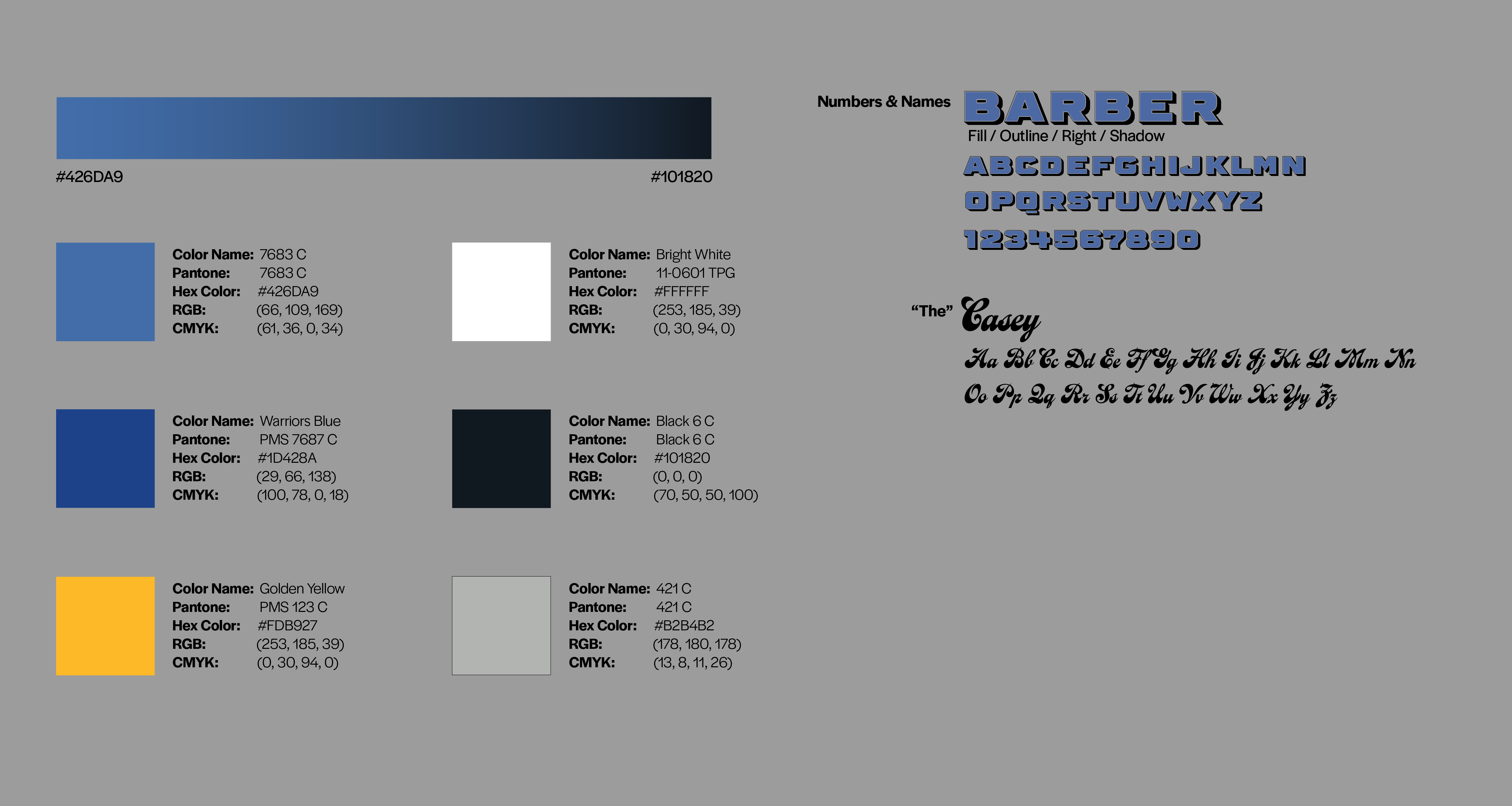
Pantone 7683 C and Black 6 C are combined together into a gradient to help blend the tree into the uniform. Casey were used to represent the cursive "The" used within the existing uniforms, while Barber was used to represent the older Warriors uniform style.
After deciding that redesigning "The Town" concept into a design that the Warriors wouldn't be seen wearing on the court brought forth the idea of breaking the Oakland Tree out of its usual circle and placing it on the shorts, while the Warriors logo would get placed behind the players numbers.
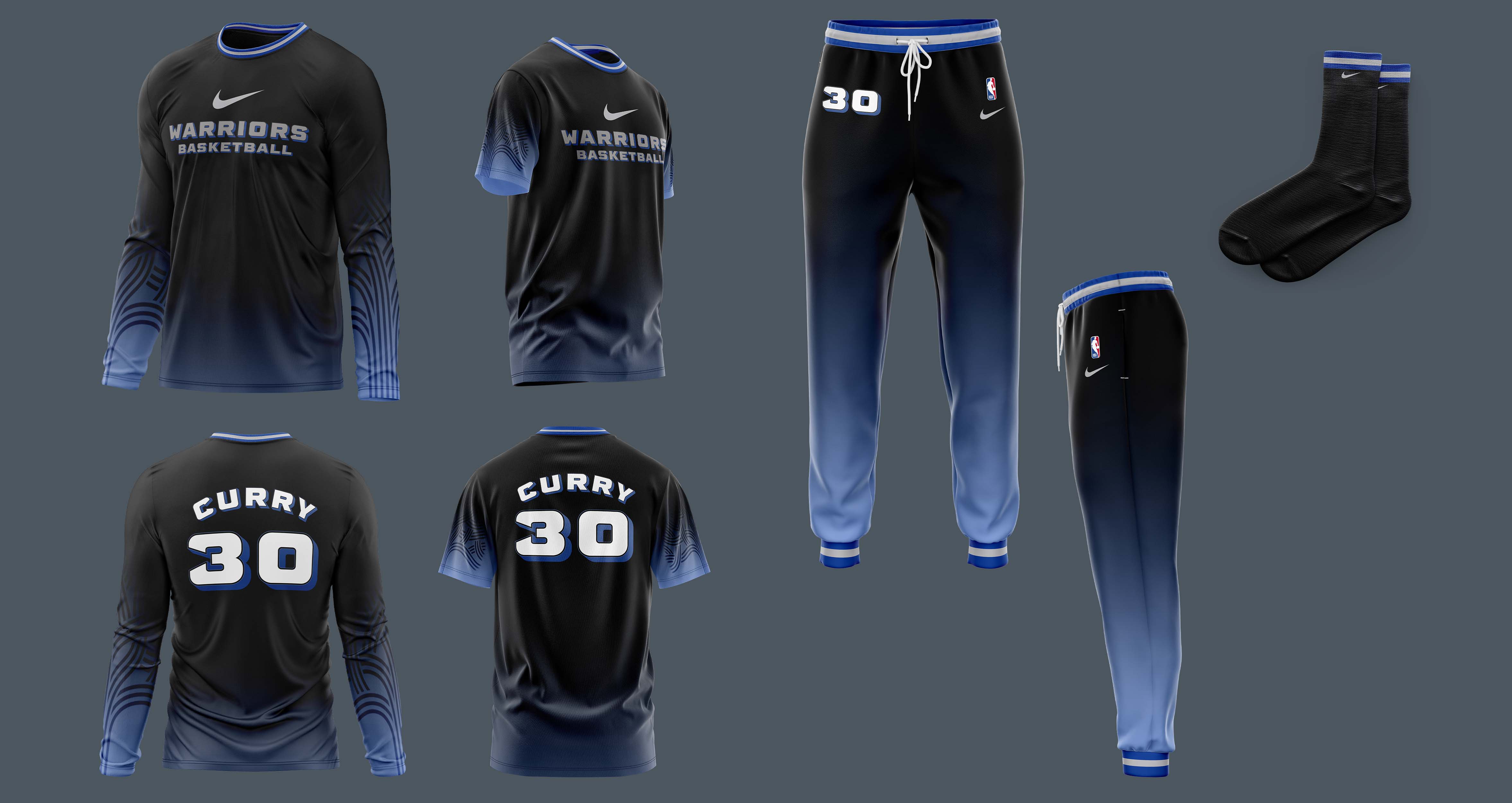
Version 1 offers the compression sleeves and leggings in the matching gradient that is used within the uniform. This is offered to as a way to bring everything together.

Version 2 offers the compression sleeves in just black, this allows the uniform to shine on its own. Allowing the audience to focus on just the uniform when its worn on the court and not anything accompanying the uniform.
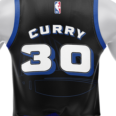
Flipping the Golden State Warriors logo to be behind the player’s number instead of in it’s normal circle. It was also switched to being outlines to become more hidden then being filled in.
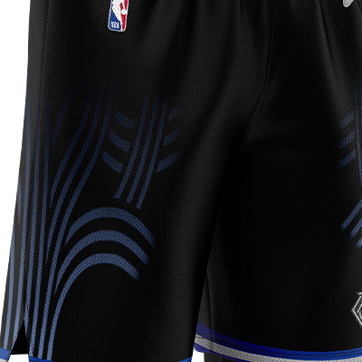
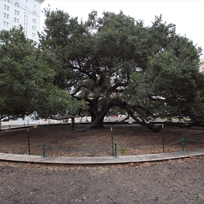
Taking the City of Oakland tree out of the circle that it’s usually placed in for “The Town” uniform including it on the sides of the shorts, helps make this uniform stand out from the other city editions.
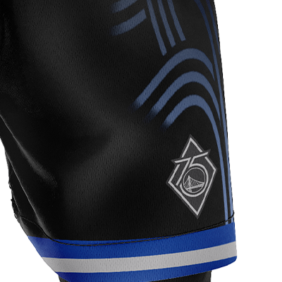
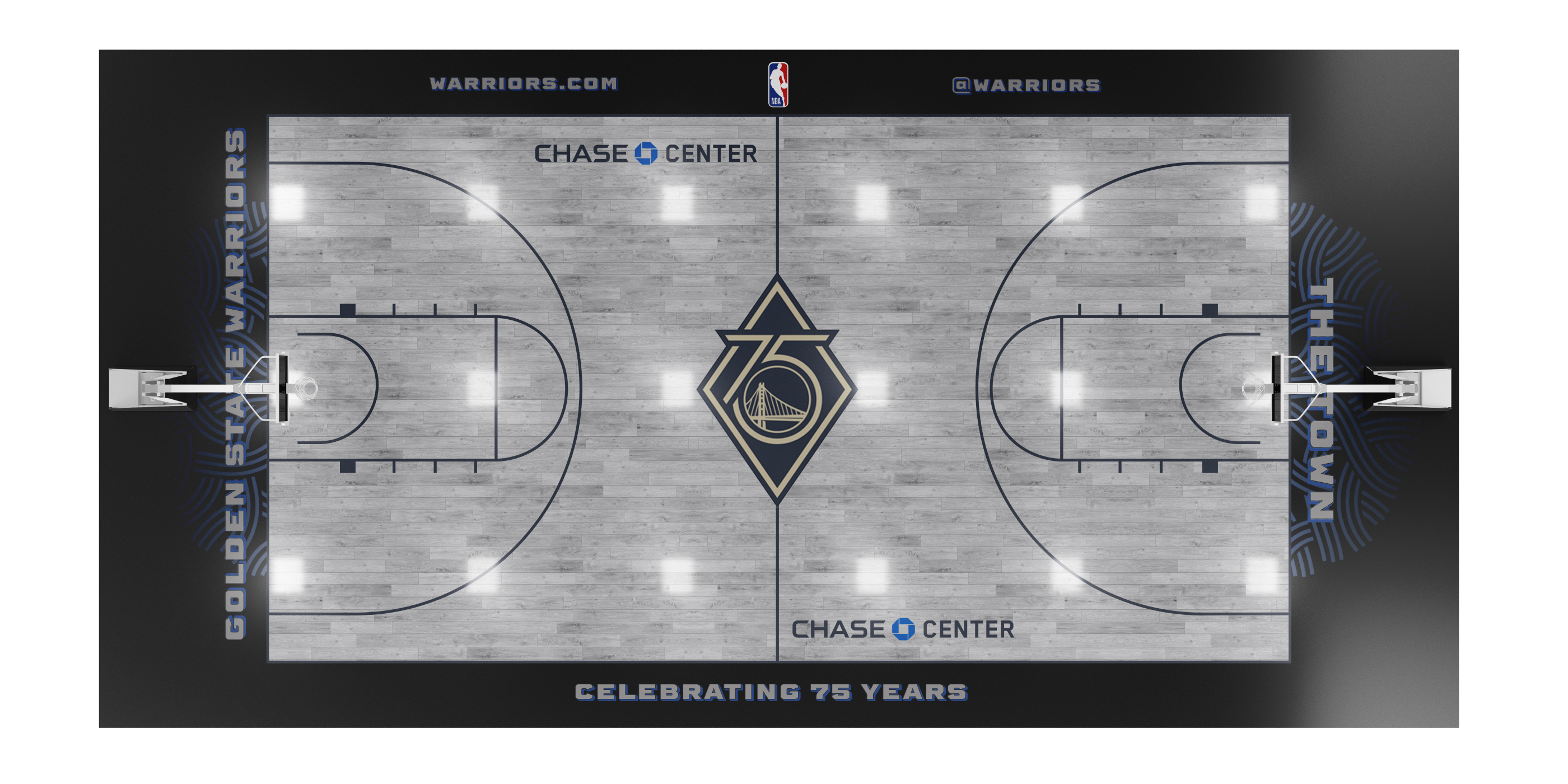
To represent the team’s 75 years in the NBA and being one of the original teams, their 75th logo is included in the bottom of the left leg.
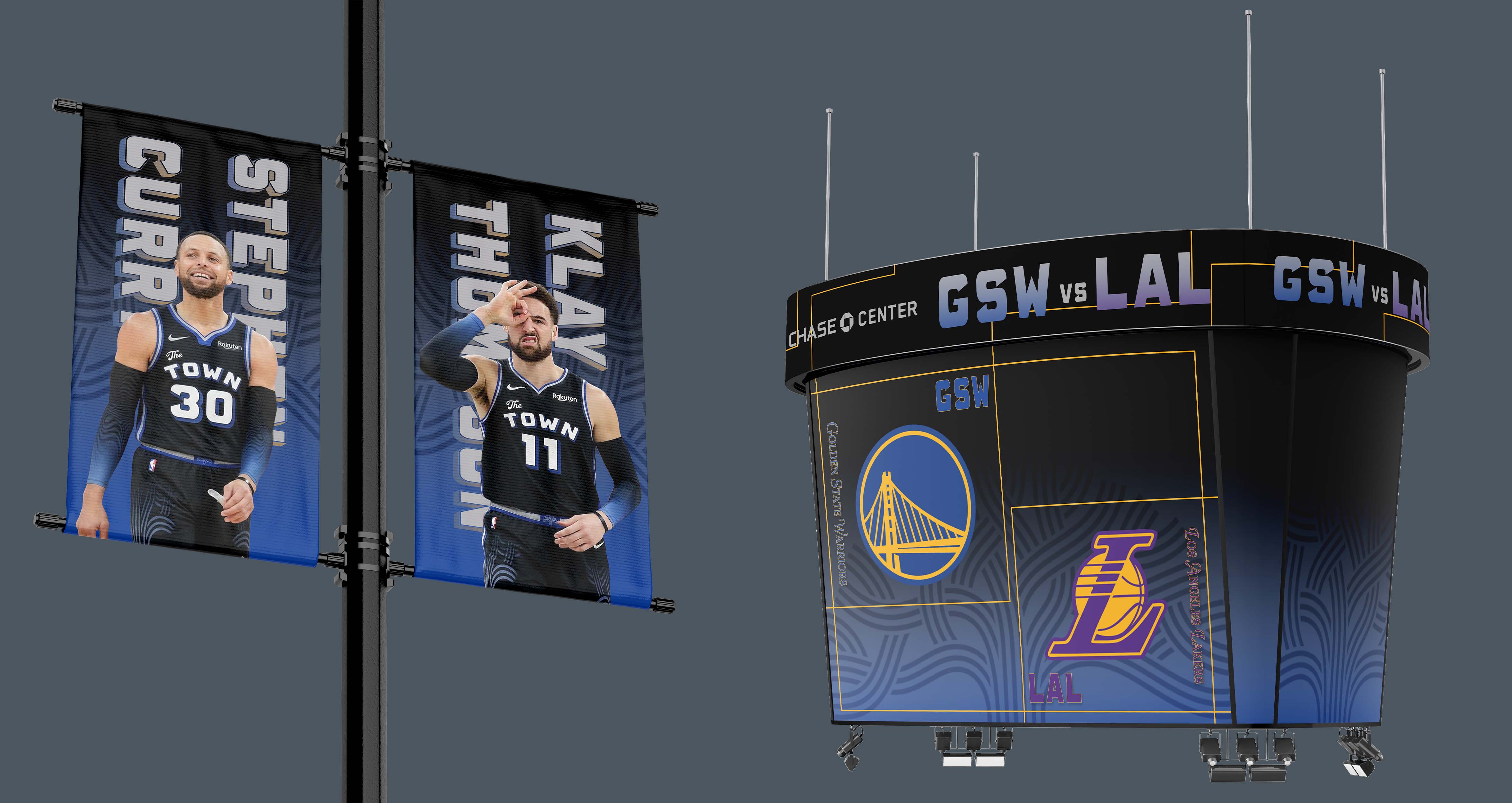
These items would be seen with the team wearing them, these would include different form of warm-ups depending on their needs. There would also be a 75th edition court that correlates with the unfiroms, banners which each player in the correlating uniform, and a megatron graphic.
For the fan items, I wanted to keep the design pretty simple to allow fans to wear them anytime. These include shirts, sweats, scarfs, a basketball, and their classic wands.